Wednesday, July 7, 2010

G-Rated Lohanicure

Dear Lindsay Lohan,

You were once super cute. I remember watching The Parent Trap maybe a dozen times when I was a kid. You had talent and a bright future. You should really grow up, kick the addiction and take your career seriously again.

Best of luck to you!

Unless you've been living under a rock, I'm sure you've heard that Lindsay Lohan has to do some time in jail. As an aside, my heart weeps for the fact that this made the national news... seriously, Brian Williams? Must have been a slow news day. But her nails, while slightly profane, were seriously cute. She was wearing a pastel air brushed design with a secret message to the judge. I used that as inspiration this morning. I'm not much in to nail art so I didn't have a clue what I was doing, but I actually thought it turned out super cute! I used 2 coats of OPI What's with the Cattitude as a base, then sponged on China Glaze Grape Pop, Heli-yum, and a bit of Essie Pretty Edgy. I used Lincoln Park After Dark and a toothpick for the message.

And really, aren't puppies cuter than the F-bomb? (There's a Friends reference in there for anyone who's a mega-fan :D)


Can't wait to wear Cattitude on it's own, it's a really pretty color!

Saturday, June 26, 2010

OPI Ogre the Top Blue

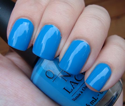
Continuing the theme of brights, I put on Ogre-the-Top Blue yesterday. This one is definitely an eye catcher. It's bold. It's a cute color but I'm not sure how much I'll really wear it. Too bad since the formula was amazing! OPI has really stepped up their game. This one is so pigmented that I nearly got away with one coat, but I ended up doing two to even out some slightly bald spots. It also applied perfectly, of course, since it's OPI. I'm a little disappointed with the lack of shiny-ness; Seche Vite can add a good amount of shine but I like a polish that can contribute to that factor. Though I may be a little biased since my last mani of Pretty Edgy was sooo shiny. As a side note, can't wait to wear that one again. I actually didn't want to take it off, which is rare for me since I love to change things up!

Wednesday, June 23, 2010

Essie Pretty Edgy

After having naked (and sad) nails for a week, I needed something bright. Essie Pretty Edgy arrived yesterday in the mail and I seriously couldn't wait to put it on. And I have to say, this color really pisses me off, and the reason is because it is so awesome... and it's Essie. Honestly, if Essie came out with colors like this (and the Resort collection) and added a new brush, she would dominate. I wouldn't even mind shelling out full price on a regular basis. But as it stands, her hits, while amazing, are too few. But I guess I shouldn't complain, because I really love this color. I dare say it might be the most perfect kelly green in existence. It's bright, bold, and feels crisp and fresh. It was perfectly opaque in 2 coats, which is always a crowd pleaser, and this color is so me it's not even funny. I even have a pair of Wayfarer sunglasses that match it almost exactly! Sadly, with this revelation, Jade is the New Black has been shoved deep into my OPI drawer... I only have room for one green on display on my desk and Pretty Edgy is now the reigning champion of that title.

I could add to my Essie rant, talking about how funny her bottles are to hold when taking pictures... and how my fingers never quite settle on them in the right way... but I'm just gonna let it go because I seriously can't stop looking at my fingers!

Friday, June 18, 2010

Back... with many pretties

I've been gone waaay too long. I took a long vacation to Oklahoma (did you know it's hot there?), and while it's nice to get away I couldn't be happier to be home. The hotel I stayed at had a Dollar Tree right down the street, and a Sally's just a block from the local Wal-mart. Both of these I have never been to, and both of these I hauled from.

Sounds like a fun trip, huh? Not so much. I got bit by a rattlesnake, and yes, it got me with some venom. I was in a car that was headbutted by a pissed off bison. And I had a tarantula the size of my shoe jump at my legs, which elicited a scream that is only heard by those who are in mortal danger. Okay, so I'm not an out doorsey kind of girl... that much I think anyone can see. And while I did get a few manis in (within the safe, air conditioned sanctuary of the Holiday Inn), I also didn't get a single picture of my NOTD's (there were only 3, but I'm still ashamed).

The good news is that I came home refreshed, and scared enough of nature to want to stay inside and swatch pretty nail polishes all day. And my fear of nature wasn't helped by the fact that my Minnesota home-coming was completely filled with tornadoes. Luckily I live outside the fray, and I still managed to get in some good pictures!

Friday, May 28, 2010

Other stuff I've been wearing

So I realize there was a huge gap in between blogs, and it was all due to a really bad break I had on my photographed hand. I still took pictures, but they're only with 2 fingers. I still like to show what I've been wearing, even if I didn't follow through with clean up and it's only half a hand!

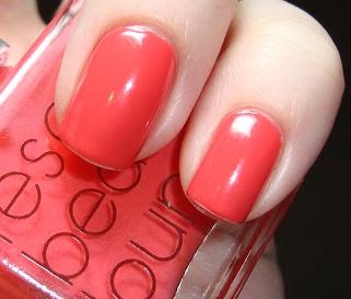
RBL Coral was huge on my lemming list for the longest time, but after putting it on I was disappointed. Yes, it is the most true coral shade I've come across, but it's so freakin' bright on my fingers! I have a couple other shades in my stash (OPI My Chihuahua bites and something from Forever 21) that are close to dupes and only a fraction of the price, so this really isn't a must have. I kind of regret dropping the cash on such a not-unique color. And it didn't even hold up, I had chipping within 18 hours.

Much like Coral, Butter LONDON Artful Dodger was has been on my lemming list a long time. A looooong time! I put in an order as a belated b-day present for myself, along with a few other shades. Unlike Coral, however, this one far exceeded my hopes. I fell in love with this the instant I put it on. It's the most perfect turquoise cream ever. It applied beautifully and wore like iron for 4 days.

I took a quick bottle comparison picture just to show the color. Artful Dodger is bluer than China Glaze Flyin High but greener than Essie Shelter Island.

Butter LONDON Fash Pack was the only BL shade I waivered on. There weren't a lot of swatches around for me to check out, and I couldn't tell if it would look good or terrible on me. At the last second I added it too my order and I'm SO glad I did. As if the perfect greigy color wasn't enough, there's a hidden pure gold shimmer to it that adds amazing depth. This also applied perfectly and wore like iron for 4 entire days before I removed it.


The gold shimmer:

Butter LONDON doesn't seem to get a whole lot of love on the NP blogs, but it's really highly ranked for me. They put out amazingly unique shades with cute names and they recently changed their formula. The change includes a bigger bottle and change to the brush. You can now easily remove the top square cap to reveal a round top to grab.


Let's compare the new Tramp Stamp to the old bottle of Portabello Pink.

The new bottle has a sticker telling you that the top portion is removable, the old bottle is pretty much impossible to remove (unless you get all Hulk on it, which I was unable to do...)


Overall, I do think that Butter LONDON is worth the money, but I recommend ordering from beauty.com. I did so, and I received a free bottle of Portabello Pink, free shipping and $10 off my entire order. Even though the free NP isn't my type, I can use the bottle for a franken and I still got a much better deal compared to the Butter LONDON website.
Thursday, May 27, 2010

StrangeBeautiful Volume 4 part 3

Let's start with the most strange of the bunch. A very wrong color choice of a cheap foundation. This color I'm not really getting. It reminds me of caramel popcorn (yum!) but I'm not really sure that's something I want to wear on my nails. I might be liking it in the fall or winter but it's too warm for spring and summer. This was 2 coats.


This is the grey, which I couldn't figure out the name of. It's a pretty standard gray with a slightly brown undertone to it. Not strange at all for the nail polish world! I love any shade of gray, I think this lighter one will tide me over until the next RBL sale when I plan to order the two awesome grays there. This was 2 coats.


An orange turban in a 15th Century Florentine portrait titled Matteo Olivier. This color is amazing. It's the most unique orange I've ever come across. It's slightly burnt but still has a crisp feel to it and it's bold without being neon and in your face like the standard neon oranges that pop up in the summer. I'm making this my official summer pedi color! This was 3 coats.


Overall this collection is really awesome. I can see myself wearing 7 out of the 8 colors over and over again, and maybe I'll eventually warm up to the last one. I'm so glad I splurged on this now, it's so perfect for summer!

Wednesday, May 26, 2010

StrangeBeautiful Volume 4 part 2

The poem Lapis Lazuli by William Butler Yeats, aka the blue. I had a hard time getting this to photograph well. It looked fantastic on my nails, all super richly-blue and smooth and shiny, but my camera lightened up the shade and made it look dull and kind of icky. Trust me, in real life, this one is a stunner. As if the color wasn't awesome enough, I did this swatch with 1 coat. Also for reference, this is deeper and richer than OPI Ogre the Top Blue.


Pink color of Rose champagne, the pink. I'm completely smitten with this shade. It's so elegant! I've said it before, but I'm not in to pink polishes. They're a dime a dozen from every nail polish designer out there and it's tough to find a shade that's unique enough to love, but this is one of them. I can actually see myself wanting to wear this more than once. This was with 2 coats and also dried super shiny with no top coat.


Aged Chartreuse, the ugly-but-loveable green. I adore ugly greens. With the new shades from OPI Shrek being so popular I hope this becomes a trend. Maybe Chanel will come out with Avacado, Under Ripe Banana and their own Rich Chartreuse as a mini ugly green collection? I can only hope! When I start applying this I was unimpressed with it's sheerness, but it turned out to be a buildable jelly and only took 3 coats to be opaque yet squishy. Is there anything more lovable than a jelly ugly green? I think not.


And to top it all off, the color reminded me of my favorite guilt-free snack... pickles!